Context


With social media at our fingertips, discovering art has never been easier. Galleries and museums are no longer the gatekeepers of the art experience—it’s all available in a personalized, scrollable feed. However as digital consumption rises, physical art spaces are seeing fewer visitors. Since the early 2000s, attendance at museums, galleries, and fairs, especially among young people, has steadily declined. This shift in trends raises an important question: What’s the trade-off for this convenience? More importantly, how is it reshaping the way artists share, monetize, and connect with their audiences?
The Problem
The world of social media isn’t necessarily one artists sought out; it’s one they found themselves thrusted into, reluctantly navigating . In today’s online landscape, independent artists feel pressured to constantly compete with shifting algorithms just to share their work and stay relevant, a struggle that can often dampen their motivation to create.

Initially, I wanted to address this problem by designing an entirely new experience—a way for art to be shared and discovered that wasn’t tied down by algorithms. But people don't just use social media because it's convenient—it’s part of how we connect. So, instead of working against it, what if I found a way to work with it? That’s where Beam comes in.
The Solution
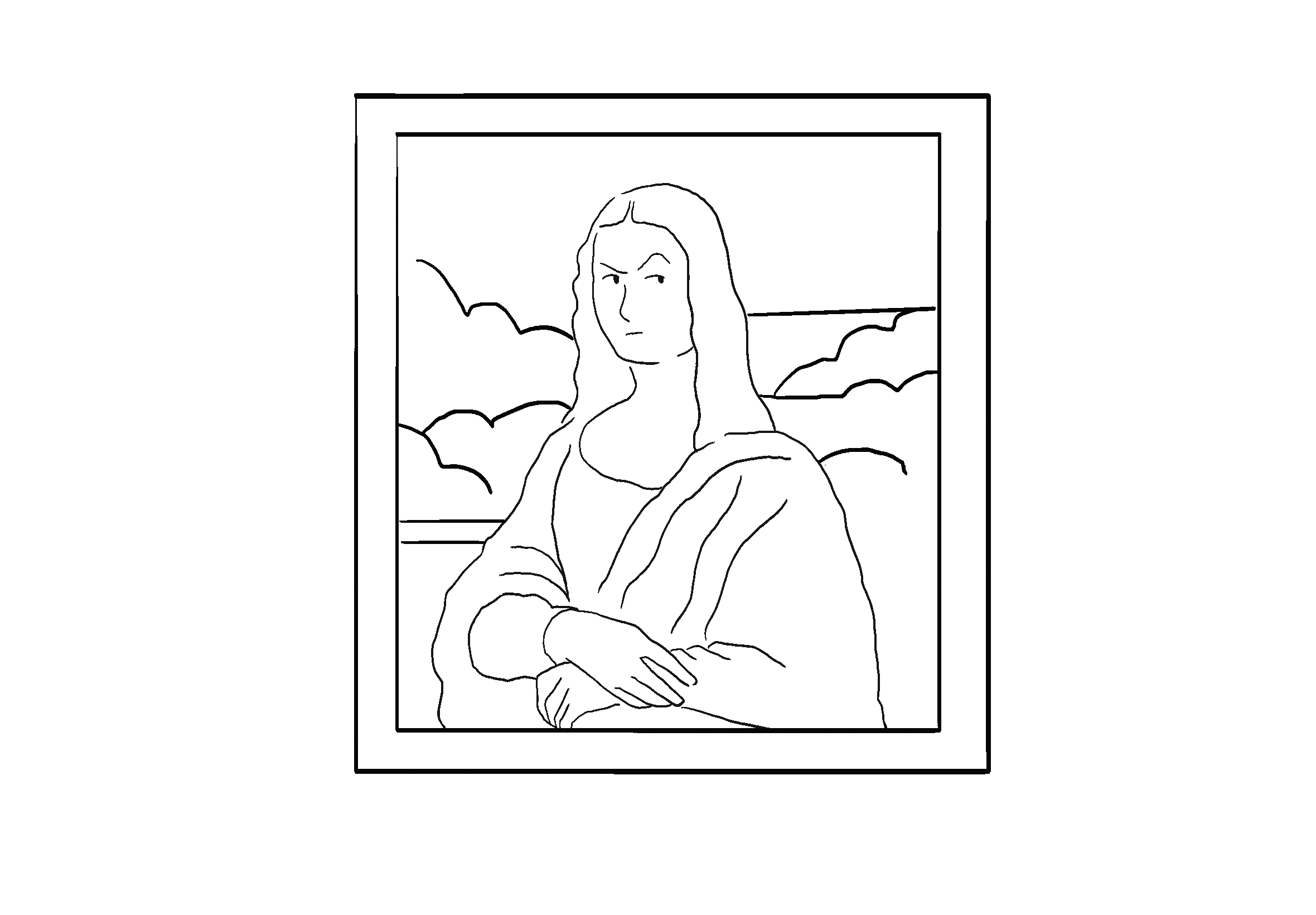
Beam is a locative art-sharing platform that seamlessly blends the digital and physical, combining the discoverability of social media with the experience of encountering art in the real world. Through GPS and augmented reality, users can discover, explore, and upload digital art within physical spaces.
I believe that the novelty of galleries, museums, or street art lies in the spontaneity of what you’ll encounter—an experience that can often be far more memorable than simply scrolling through social media posts. Beam seeks to replicate this experience digitally.
The Challenge
In this case study, I will highlight one of my main responsibilities: ideating, researching, and designing the content discovery experience, specifically, how users navigate Beam's map interface to find relevant content.
User Research
We wanted to target young artists and enthusiasts. Initially, my priority was to see if this demographic would even be interested in Beam as an idea. So to gain a bit more insight, I surveyed over 100 potential users to understand things like their go-to social media platforms, preferred artistic mediums, and familiarity with augmented reality. Here’s what I found:
Our surveyed users showed interest in Beam, but competing with platforms like Instagram and Twitter meant we had to stand out. How would our users go about actually finding content? To truly bridge that gap between the physical and digital, I needed a more interactive experience—that’s when the concept of incorporating a map came to mind.
Wireframing
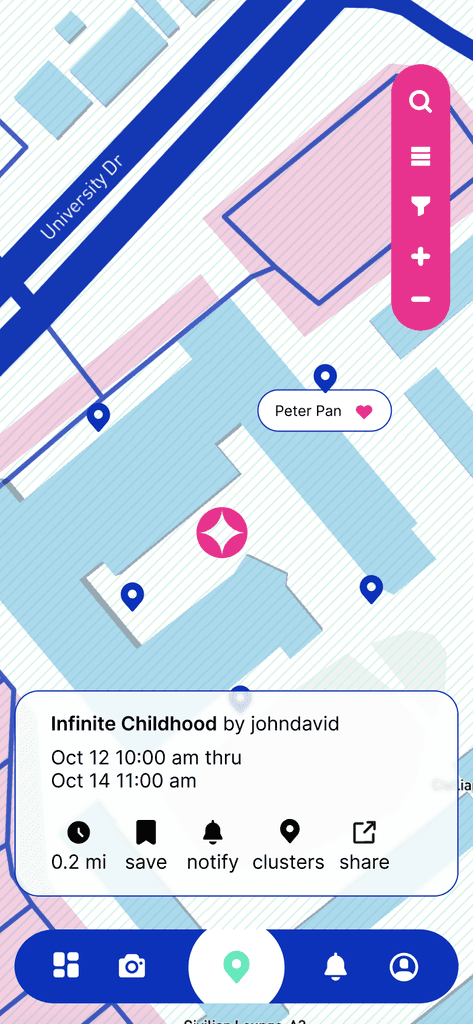
The idea was to have all uploaded artwork appear as markers on a map, displaying the title and artist's name. Users could bookmark locations for later viewing and share them with others. Once they found a piece that sparked their interest, they could then get directions to view it through AR on their mobile device.


Competitive Analysis
While refining the design, I realized my approach was somewhat one-dimensional. I wasn’t just creating a platform for sharing art—I was developing a navigational system for experiencing it. To guide me through the process, I needed stronger references to inform my decisions.
So I conduct a competitive analysis, focusing mostly on navigation apps with features I found tangential to Beam's goals. I wanted to understand how users interacted with them and identify potential pain points I could run into.

The primary challenges I identified among our competitors included GPS inaccuracies and unreliable search functionality. For instance, Geocache users frequently encountered misplaced cache locations, leading to wasted hours with no reward. Or how Apple Maps, while praised for its intuitive map interface, has many of its users turning to Google when searching for the best rated dining spots or the nearest barbershop.
I kept these in mind going forward in anticipation that I would likely encounter similar problems.


Initial Design
Focusing On Navigation
For the first iteration, I conducted an unmoderated usability test with 12 participants, maintaining a 3:2 ratio of art consumers to creators. I aimed to gather insights from both audiences to understand their perspectives on the design. This initial test focused on evaluating users' ability to navigate the map, locate markers, and share content.
The Final Design
Based on the initial test results, it was clear we had a lot of fires to put out. The feedback I received demonstrated that I was not effectively communicating Beam’s purpose to our users, especially the consumers. So here are the changes I implemented to tackle the problem.
Notifications and time limits
I introduced time limits to prevent users from "hoarding" locations while also creating a sense of urgency to drive engagement. Users can set notifications to alert them before their uploaded art is removed. Additionally, this feature could help optimize server data management if integrated into code.
Navigation and sharing
The navigation and sharing features were enhanced, giving users a clearer, way to discover markers and share them with others.
Search functionality
An updated filtering system for users to search for artwork by category and distance.
Marker clusters
The final feature, clusters, was a bit experimental—designed for users to group multiple uploaded pieces into a single general location. While it wasn’t as polished as I had envisioned, I was still happy to see it implemented to some capacity.
I was able to conduct another unmoderated usability test with 10 users following our final iterations. These were our final results:
Things I Would Do Differently…
Exploring what content moderation could look like on a platform like Beam is essential. Art is a form of expression, and defining the type of expression we want to support on our platform is not only crucial for our users but also for reflecting our core values.
Beam was designed only with iOS in mind, but we failed to consider integrating Apple's Mapbox for further AR development until much later in the project and there was not enough time left to experiment with it.
Labeling the navigation tabs. The icons we used were not intuitively recognizable to many users.