

Checking In With Visio

Context
Some days, it's a sharp pain that makes simple tasks feel monumental. Other days, it confines you to bed, overwhelming your body and mind. Over time, it becomes a constant presence—fading into the background yet deepening feelings of isolation.
The Problem
A study by the National Institute of Health found that chronic pain sufferers often face added psychological distress when they feel unsupported by their social network. This isn't surprising, but it raises the question: how do you communicate chronic pain to those who haven’t experienced it?
The Solution
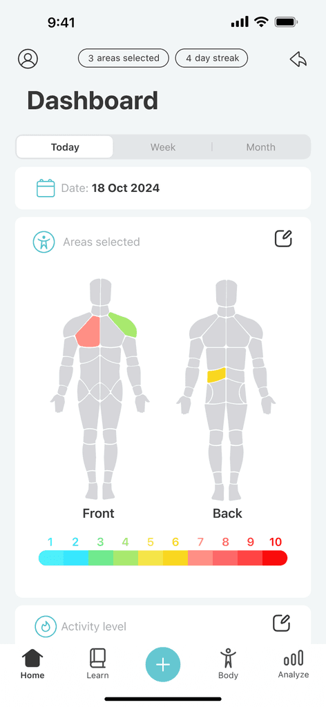
Visio empowers individuals with chronic pain to take control of their health through daily self-check-ins, guided physical therapy exercises, and CBT resources. The goal is to help users track and identify patterns to better understand the factors potentially influencing their pain and improve communication with caregivers and loved ones.

My Role
I was primarily tasked with designing Visio's daily check-in feature. Which would involve users being prompted to log their symptoms in order to gather a broader dataset and monitor changes in mood and health over time. They may be asked to rate their pain, where it hurts, and how it is affecting their day to day activities. Users may also provide information about any treatments and/or medications they may be taking.
User Research
Pain and Perspective
The studies I discovered were insightful. However, to truly understand the user's perspective, I needed to hear directly from individuals living with chronic pain. So, I surveyed 50 participants and focused on questions that would help inform my design.
These questions helped me uncover the real, unfiltered experiences of users and revealed the ways they adapt and navigate their life each day. Here’s what I learned:
Competitive Analysis
How Do Other Platforms Handle Logging?


All information is logged vertically within a single area to minimize context switching.
Pro: simplifies information by consolidating everything into a single interface.
Con: asking users to input multiple data points at once can feel overwhelming if the information isn’t properly segmented.
Category 3: Visual Input
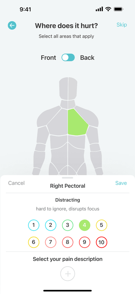
A more visual approach, incorporating features like body zone selectors for quick and easy logging.
Pro: generally the most straightforward and intuitive.
Con: potentially too complex for those with pain concentrated in a single area such as migraines.

While users generally preferred the third category for logging, after further analysis I realized there was value in all three approaches. My idea going forward would be to take the best aspects from each category and combine them to meet the goals of our project.
Initial Design
The check-in process involves interacting with the body diagram to select the affected areas, rating the intensity of their pain using a scale, and choosing from a list of common pain descriptors (ie radiating, burning, aching etc.) for the most accurate assessment of how they felt.
I would then conduct a usability test with a pool of 15 users. The goal was to determine how often they would be willing to check in (daily, frequently, infrequently, or never) and whether they would be willing to share insights about their pain, gathered through the app, with their support network.
Final Design
Leaning Out The Process
Conclusion
Measuring Success
After these iterations, I conducted 10 usability tests. Although the user pool was slightly smaller, I maintained consistent questions from the previous session to ensure reliable feedback.
What I've Learned
Chronic pain is very complex and difficult to grasp without firsthand experience. Every design decision demanded empathy and care, but ultimately, I recognized that this idea wasn’t the right solution for everyone. While some users felt it gave them a sense of control over their pain, others found it unhelpful and only wanted to use tools and treatments that provided them with immediate relief. This project taught me that design, while powerful, is not a one-size-fits-all solution for complex problems.
Things I Would Do Differently
Develop a more comprehensive onboarding process to collect user health information earlier in the journey
Allocate more time to gather a larger testing sample, as the small user pool made it challenging to evaluate the design's effectiveness
Explore and test additional design iterations to refine and optimize the solution