Reimagining how art is shared and nurturing meaningful connections among creators and enthusiasts alike.
Team
Chloe Aldrich— PM, UI
Melanie Gonzales— UI
Gabriella Romano— UXR
Timeline
Aug-Oct 2022
Project Type
Academic
Role
User Experience, Ideation, User research, Wireframing, Prototyping, Usability testing

Reimagining how art is shared and nurturing meaningful connections among creators and enthusiasts alike.
Team
Chloe Aldrich— PM, UI
Melanie Gonzales— UI
Gabriella Romano— UXR
Timeline
Aug-Oct 2022
Role
User Experience, Ideation, User research, Wireframing, Prototyping, Usability testing
Project Type
Academic

The Problem
Artists and The Algorithm Rat Race
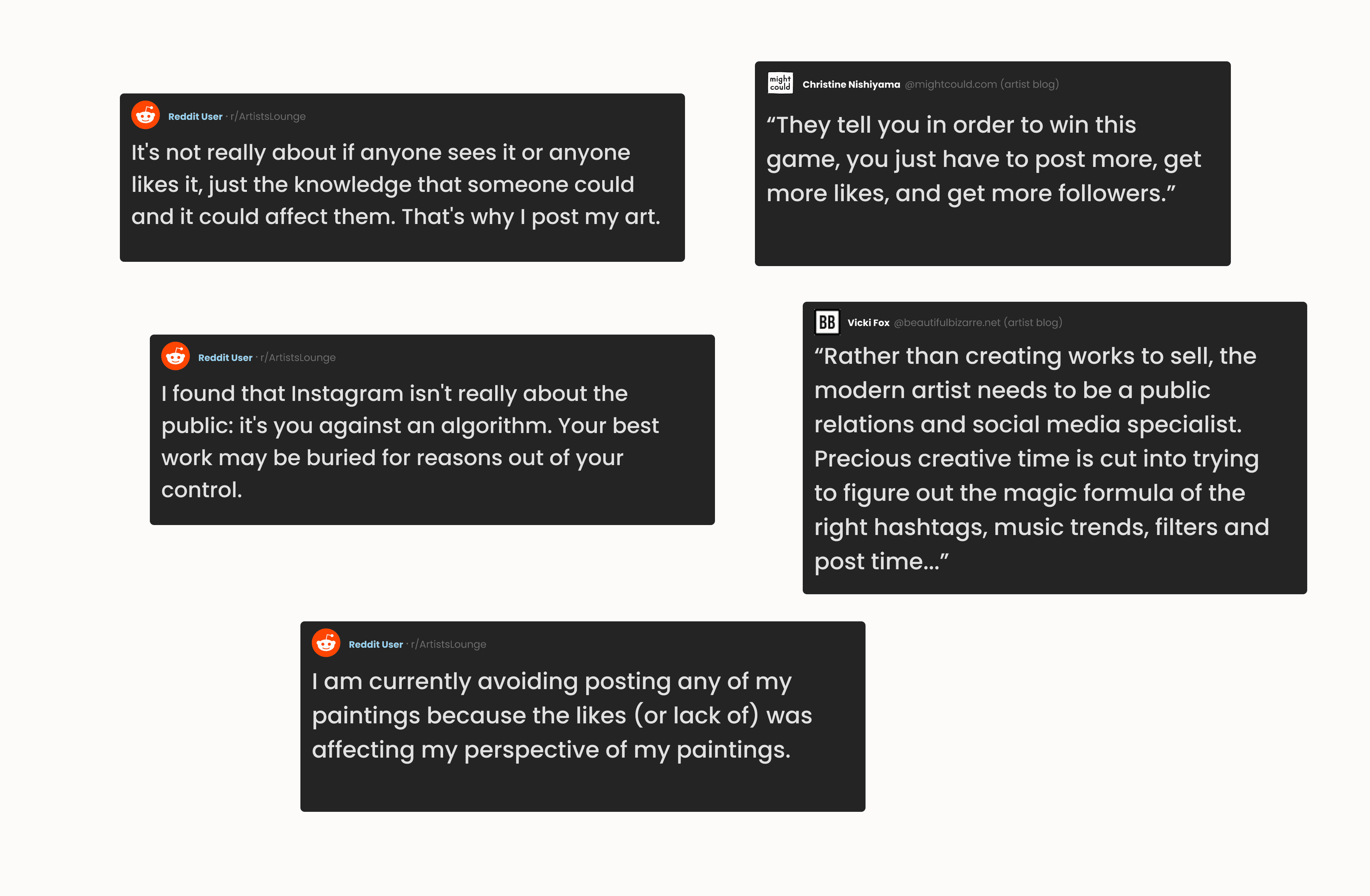
In today's online landscape, small artists feel pressured to constantly compete against ever-changing algorithms in order to share their work and stay relevant, diminishing their passion and dampening motivation to create.

The Solution
What If We Bridged The Digital and Physical?
Beam serves as a locative media platform, offering artists a more stress-free and engaging environment to sharing their work. Users will be able to upload, explore, and discover digital art in physical space, think of it like digital graffiti!
Encouraging artists to actively seek out and share art in person, rather than just scrolling through it on social media, fosters stronger a connection among artists and mitigates a few of the challenges posed by social media algorithms.
The Challenge
Designing For Discovery
Sounds great! But how exactly will users go about discovering the supposed tens of hundreds of artwork being uploaded at any given time? This was one of the major challenges I faced during this project, and will be the focus of this case study.

Research
Competitive Analysis
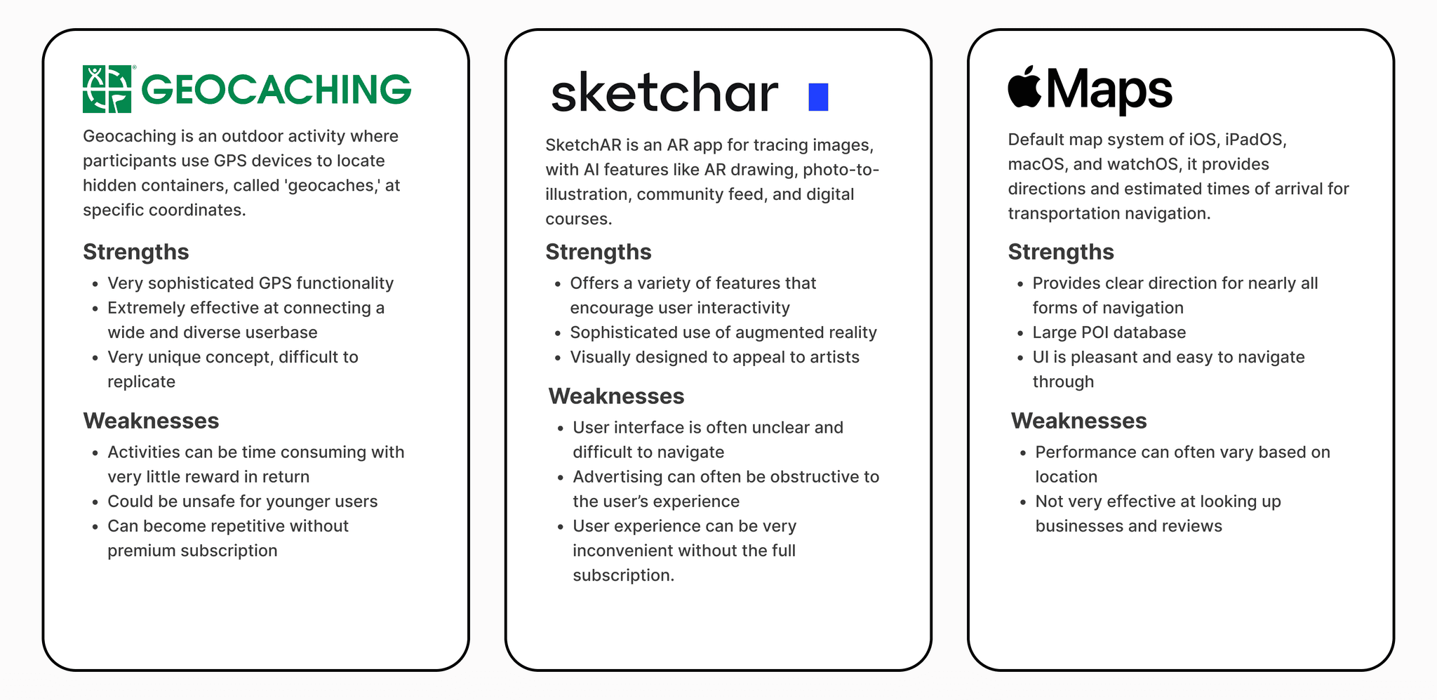
Due to my limited knowledge of locative technology, I began the project with a competitive analysis in order to understand how other apps utilized it, and what aspects I could integrate into my own design.
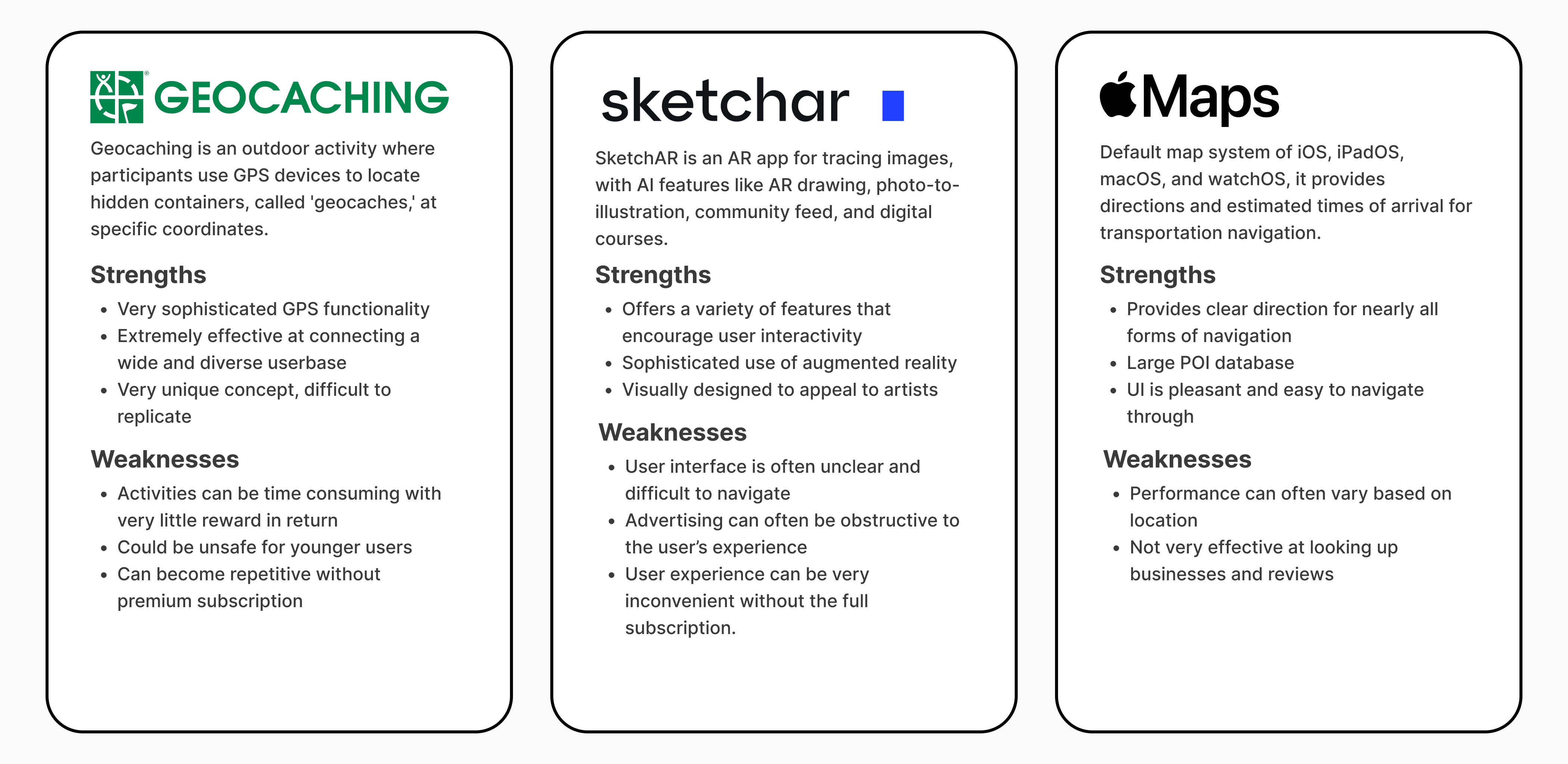

I focused primarily on AR, locative media, and navigation apps, I determined that while AR was an important aspect of this project, a well-designed GPS experience would be the backbone, as it would help facilitate user discoverability.
How familiar Are Our Users With Augmented Reality?
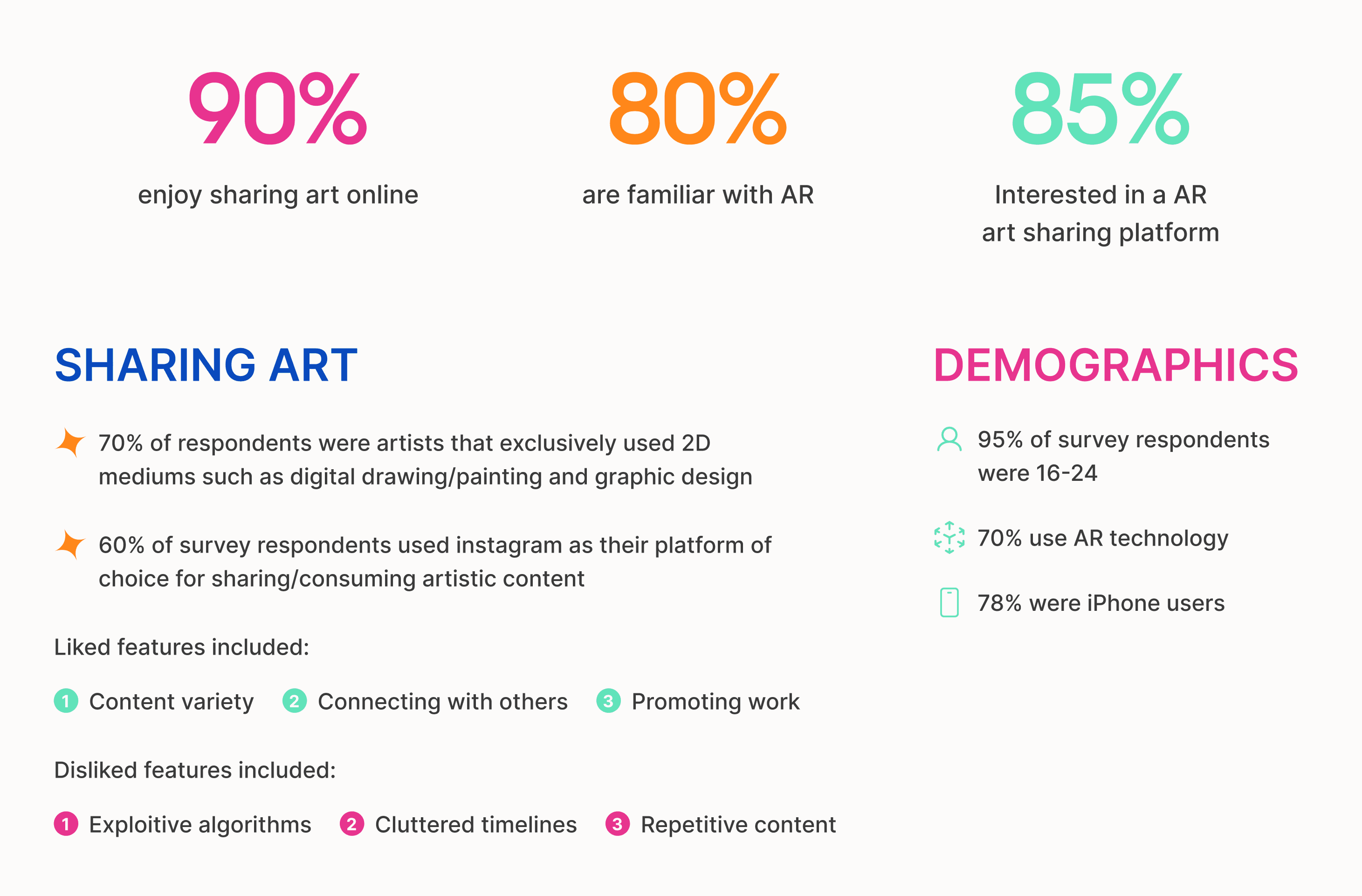
Initially we were concerned about our product being too niche for any sizable user-base; We wanted to appeal to young and enthusiastic new/small artists. However, because we did not yet have a working prototype I decided to create a user survey to gauge interest.
The survey consisted of a combination of over 100 artists and enthusiasts. The goal was to to learn about which existing platforms they preferred, why, and their familiarity with augmented reality. Here is what I found:

Design
Mapping Things Out
Following the research results, I was feeling more confident about approaching the project and began to lay out the general flow of Beam's entire map experience.
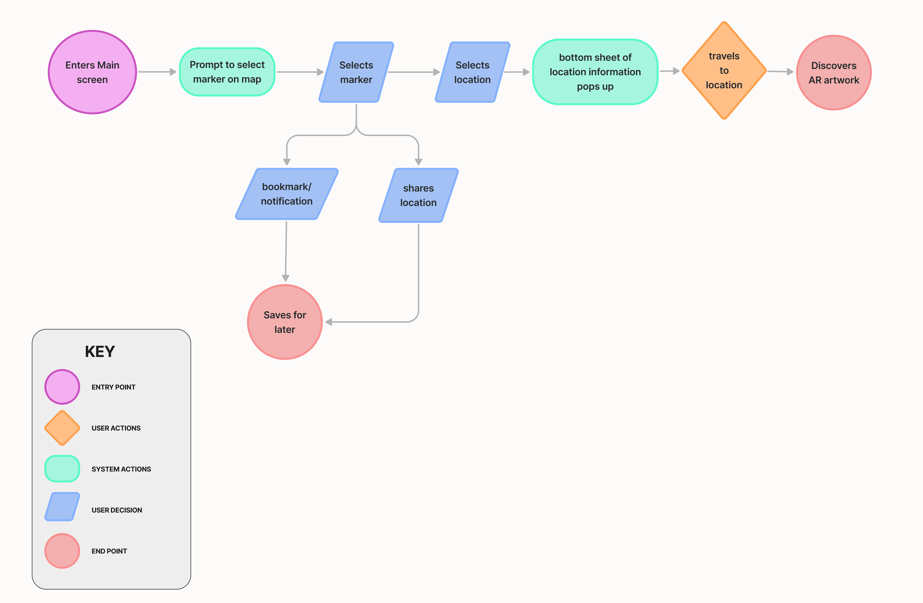

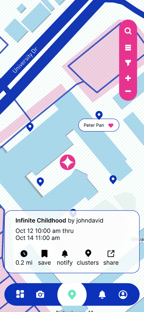
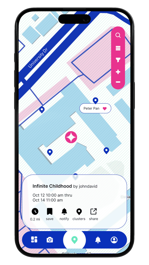
The initial designed experience was as follows; all uploaded art would be displayed as a marker with each marker containing a title, location, and information about the artist. Users would also be able to bookmark the location for later viewing and/or share it with others.
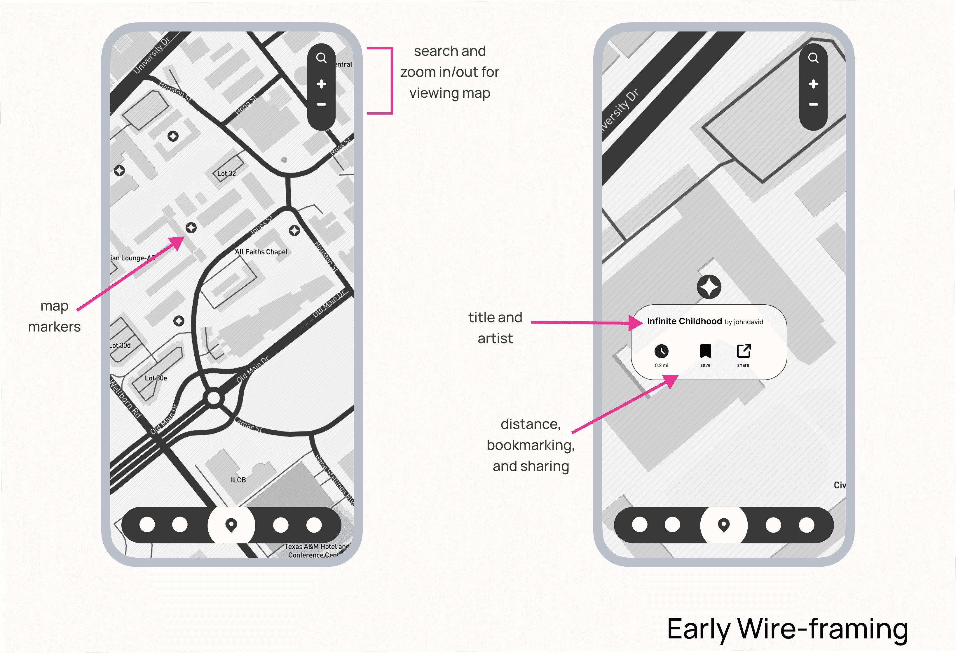

Initial Design
Iterative User Testing
I conducted an unmoderated usability test with a 3:2 ratio of users who consume art content to artists who create it. This test, focused on our first iteration, aimed to assess whether users could effectively navigate the map, find markers and locations, and share content.
I also asked users for feature suggestions to improve the experience and gathered feedback on overall user satisfaction!
Initial Results
40% of content consumers and 60% of artists expressed interest in Beam as a platform
60% of overall users demonstrated a solid ability to navigate through Beam's map effectively
Some users expressed the need to see a much more polished product before reaching any conclusions about it
Key takeaways
Implementing an introductory walkthrough might help ease users into the experience
A filter system could help users find content faster
Users expressed confusions about how long their uploaded art work could remain in any given location (which I did not think about…)
Based on user tests, I concluded that we needed to focus on making the app more user-friendly for consumers, not just creators. I noticed that while artists were more forgiving of design flaws because they appreciated our efforts, our consumers were not. It was important to create organic excitement for both groups by improving the overall experience.
Implementing Marker Clusters
Final Design
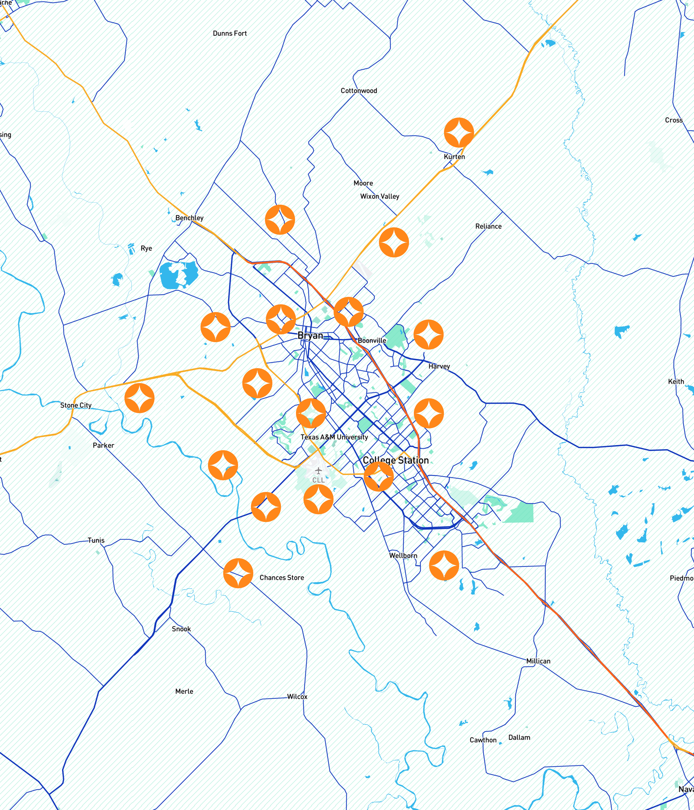
The last feature we were able to implement was marker clustering, where users see can pieces that have been uploaded in the same general location as a cluster.
This feature was not as developed as I wanted, however, I was glad to see it implemented to some capacity.
40% increase in user satisfaction
An increased number of users expressed desire in utilizing the check-in experience frequently after design iterations
Improved searchability
Implementing search and filter options made it much easier to find content for our users, leading to an increase in overall engagement
Streamlined data storage
Implementing time limits on uploaded posts helped to minimize potentially overwhelming our system with data issues leading to a more efficient product
Conclusion
Measuring Success
60% increase in user satisfaction
An increased number of users expressed desire in utilizing the check-in experience frequently after design iterations
Improved searchability
Implementing search and filter options made it much easier to find content for our users, leading to an increase in overall engagement
Streamlined data storage
Implementing time limits on uploaded posts helped to minimize potentially overwhelming our system with data issues leading to a more efficient product
Walkthrough and Storage Efficiency
Final Design
Based on user feedback, we implemented two new features: a top sheet with instructions and a time limit on uploaded pieces to optimize database storage.
Search and Filter
Final Design
We improved user's ability to search and find content much faster by implementing a search and filter system. Users can locate content by distance and category.
Initial Results
40% of content consumers and 60% of artists expressed interest in Beam as a platform
60% of overall users demonstrated a solid ability to navigate through Beam's map effectively
Some users expressed the need to see a much more polished product before reaching any conclusions about it
Key takeaways
Implementing an introductory walkthrough might help ease users into the experience
A filter system could help users find content faster
Users expressed confusions about how long their uploaded art work could remain in any given location (which I did not think about…)
Based on user tests, I concluded that we needed to focus on making the app more user-friendly for consumers, not just creators. I noticed that while artists were more forgiving of design flaws because they appreciated our efforts, our consumers were not. It was important to create organic excitement for both groups by improving the overall experience.
Iterative User Testing
Initial Design
I conducted an unmoderated usability test with a 3:2 ratio of users who consume art content to artists who create it. This test, focused on our first iteration, aimed to assess whether users could effectively navigate the map, find markers and locations, and share content.
I also asked users for feature suggestions to improve the experience and gathered feedback on overall user satisfaction!
Final Design
Walkthrough and Storage Efficiency
Based on user feedback, we implemented two new features: a top sheet with instructions and a time limit on uploaded pieces to optimize database storage.
Final Design
Search and Filter
We improved user's ability to search and find content much faster by implementing a search and filter system. Users can locate content by distance and category.
Final Design
Implementing Marker Clusters
The last feature we were able to implement was marker clustering, where users see can pieces that have been uploaded in the same general location as a cluster.
This feature was not as developed as I wanted, however, I was glad to see it implemented to some capacity.
Conclusion
Measuring Success
40% increase in user satisfaction
Between the consumers and creators we saw a 40% increase in overall user interest after implementing design changes
Improved searchability
Implementing search and filter options made it much easier to find content for our users, leading to an increase in overall engagement
Streamlined data storage
Implementing time limits on uploaded posts helped to minimize potentially overwhelming our system with data issues leading to a more efficient product
What I've Learned
There is no such thing as too much research…
Maybe not exactly true, however, I did leave this project feeling like I could have dove much, much deeper into product research. Just because I use a product, does not mean I understand how it actually works.
Avoid being too attached to ideas
I had the opportunity to work with very talented designers for this project. However, because I kickstarted the idea, I was becoming too attached to whatever initial vision i had of the project, and had to learn to be open to suggestions.
Things I would do differently…
Designing with a slightly more business minded approach
label the navigation bar some icons did not seem intuitively recognizable to users
Taking time to flesh out the problem space and user needs
Exploring and testing more design iterations before deciding on a final design
Congrats! You've reached the end. Wanna see more?
Let's work
together!
Let's work
together!
The Problem
Artists and The Algorithm Rat Race
In today's online landscape, small artists feel pressured to constantly compete against ever-changing algorithms in order to share their work and stay relevant, diminishing their passion and dampening motivation to create.


The Challenge
Designing For Discovery
Sounds great! But how exactly will users go about discovering the supposed tens of hundreds of artwork being uploaded at any given time? This was one of the major challenges I faced during this project, and will be the focus of this case study.


Research
Competitive Analysis
Due to my limited knowledge of locative technology, I began the project with a competitive analysis in order to understand how other apps utilized it, and what aspects I could integrate into my own design.
I focused primarily on AR, locative media, and navigation apps, I determined that while AR was an important aspect of this project, a well-designed GPS experience would be the backbone, as it would help facilitate user discoverability.

Design
Mapping Things Out
Following the research results, I was feeling more confident about approaching the project and began to lay out the general flow of Beam's entire map experience.
The initial designed experience was as follows; all uploaded art would be displayed as a marker with each marker containing a title, location, and information about the artist. Users would also be able to bookmark the location for later viewing and/or share it with others.


How familiar are our users with augmented reality?
Initially we were concerned about our product being too niche for any sizable user-base; We wanted to appeal to young and enthusiastic new/small artists. However, because we did not yet have a working prototype I decided to create a user survey to gauge interest.
The survey consisted of a combination of over 100 artists and enthusiasts. The goal was to to learn about which existing platforms they preferred, why, and their familiarity with augmented reality. Here is what I found:


What If We Bridged The Digital and Physical?
Beam serves as a locative media platform, offering artists a more stress-free and engaging environment to sharing their work. Users will be able to upload, explore, and discover digital art in physical space, think of it like digital graffiti!
The Solution
Encouraging artists to actively seek out and share art in person, rather than just scrolling through it on social media, fosters stronger a connection among artists and mitigates a few of the challenges posed by social media algorithms.
Iterative User Testing
I also asked users for feature suggestions to improve the experience and gathered valuable feedback!
I conducted an unmoderated usability test with a 3:2 ratio of users who consume art content to artists who create it. This test, focused on our first iteration, aimed to assess whether users could effectively navigate the map, find markers and locations, and share content.
Initial Design
Initial Results
40% of content consumers and 60% of artists expressed interest in Beam as a platform
60% of overall users demonstrated a solid ability to navigate through Beam's map effectively
Some users expressed the need to see a much more polished product before reaching any conclusions about it
Key takeaways
Implementing an introductory walkthrough might help ease users into the experience
A filter system could help users find content faster
Users expressed confusions about how long their uploaded art work could remain in any given location (which I did not think about…)
Based on user tests, I concluded that we needed to focus on making the app more user-friendly for consumers, not just creators. I noticed that while artists were more forgiving of design flaws because they appreciated our efforts, our consumers were not. It was important to create organic excitement for both groups by improving the overall experience.
Walkthrough and Storage Efficiency
Based on user feedback, we implemented two new features: a top sheet with instructions and a time limit on uploaded pieces to optimize database storage.
Final Design
Implementing Marker Clusters
This feature was not as developed as I wanted, however, I was glad to see it implemented to some capacity.
The last feature we were able to implement was marker clustering, where users see can pieces that have been uploaded in the same general location as a cluster.
Final Design
Conclusion
Measuring Success
40% increase in user satisfaction
An increased number of users expressed desire in utilizing the check-in experience frequently after design iterations
Improved searchability
Implementing search and filter options made it much easier to find content for our users, leading to an increase in overall engagement
Streamlined data storage
Implementing time limits on uploaded posts helped to minimize potentially overwhelming our system with data issues leading to a more efficient product
Search and Filter
We improved user's ability to search and find content much faster by implementing a search and filter system. Users can locate content by distance and category.
Final Design
What I've Learned
There is no such thing as too much research…
Maybe not exactly true, however, I did leave this project feeling like I could have dove much, much deeper into product research. Just because I use a product, does not mean I understand how it actually works.
Avoid being too attached to ideas
I had the opportunity to work with very talented designers for this project. However, because I kickstarted the idea, I was becoming too attached to whatever initial vision i had of the project, and had to learn to be open to suggestions.
Things I would do differently…
Designing with a slightly more business minded approach
label the navigation bar some icons did not seem intuitively recognizable to users
Taking time to flesh out the problem space and user needs
Exploring and testing more design iterations before deciding on a final design
