
Visio

Area
MedTec
Team
3 Designers
Duration
3 Months
Tools
Figma
In a Hurry?
Click through for a quick summary.


The Problem
Those with chronic pain feel misunderstood
A study by the National Institute of Health found that chronic pain sufferers often face added psychological distress when they feel unsupported by their social network. This isn't surprising, but it raises the question: how do you communicate chronic pain to those who haven’t experienced it?


My Role
Help Users Track Their Pain
I was responsible for designing Visio’s daily check-in feature, prompting users to log symptoms, pain levels, affected areas, mood, daily activity impact, and any treatments or medications to track changes over time.
My north star principles:
Equip users with a better way to communicate their experiences to caretakers and loved ones
Provide users with a self-sufficient tool to understand and manage their chronic pain
Make it as convenient to use as possible
User Research
Pain and Perspective
The studies I discovered were insightful. However, to truly understand the user's perspective, I needed to hear directly from individuals living with chronic pain. So, I surveyed 50 participants and focused on questions that would help inform my design.
Questions
What treatments have you used to aid in relieving pain? Was it helpful?How effectively are you able to communicate your pain to others?
Which methods, if any, do you use to track changes in your pain?
What treatments have you used to aid in relieving pain? Was it helpful?
Survey Takeaways
Most respondents seemed interested in having a simpler way to keep track of possible flair-ups and irregularities in their pain from daily activity.
Some respondents felt that constantly tracking their pain might be distressing but were more open to it if the process was simple.
Pain is extremely subjective. When rating pain, one person's 4 could be another person's 10 and it can be difficult to communicate the severity of the pain even to trained professionals. Numbers alone cannot paint the full picture.
Competitive Analysis
How Do Other Platforms Handle Logging?
Why design a logging process? My competitive analysis showed that nearly every app in this space relied on check-ins or logging as a core feature. By analyzing their flows, a clear pattern began to emerge.
All the apps I analyzed used one of three check-in approaches: slider scales, step-by-step linear flows, or visual formats. I tested these methods with individuals experiencing chronic pain and gathered their feedback.
Category 1: Slider Input
Users can drag a bar from 'No pain' to 'Worst pain' or with a simple 1-10 scale.
Pro: interactive, intuitive, and visually clean.
Con: lacks depth and fails to provide details regarding what the numbers actually mean.


Category 2: Linear Input
All information is logged vertically within a single area to minimize context switching.
Pro: simplifies information by consolidating everything into a single interface.
Con: asking users to input multiple data points at once can feel overwhelming if the information isn’t properly segmented.
Category 3: Visual Input
A more visual approach, incorporating features like body zone selectors for quick and easy logging.
Pro: generally the most straightforward and intuitive.
Con: potentially too complex for those with pain concentrated in a single area such as migraines.

While users generally preferred the third category for logging, after further analysis I realized there was value in all three approaches. My idea going forward would be to take the best aspects from each category and combine them to meet the goals of our project.
Initial Design
Focusing On Navigation
For the initial design, I focused primarily on assessing how quickly users could navigate through check-in and how useful they found it to be.
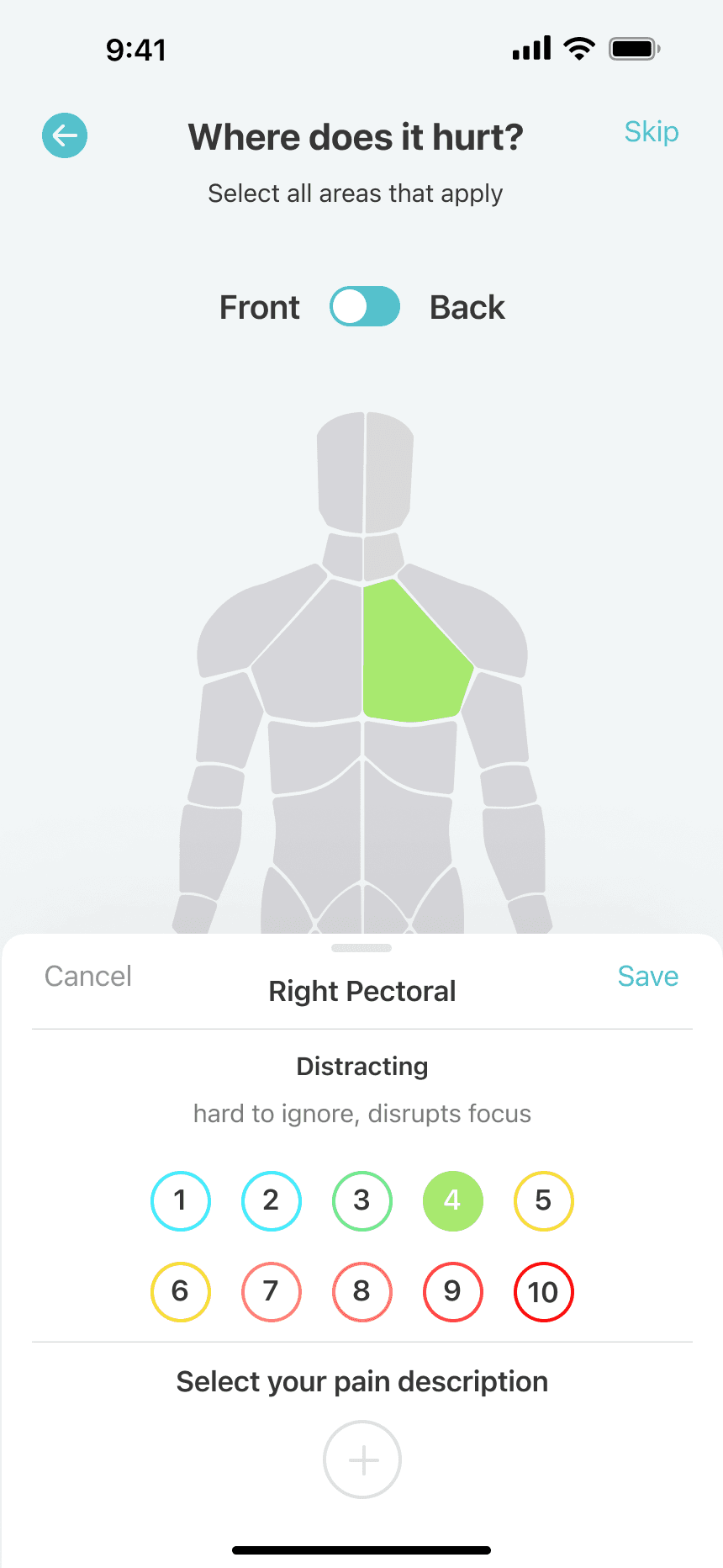
The check-in process involves interacting with the body diagram to select the affected areas, rating the intensity of their pain using a scale, and choosing from a list of common pain descriptors (ie radiating, burning, aching etc.) for the most accurate assessment of how they felt.
I would then conduct a usability test with a pool of 15 users. The goal was to determine how often they would be willing to check in (daily, frequently, infrequently, or never) and whether they would be willing to share insights about their pain, gathered through the app, with their support network.
Initial Results
around 45% of users said they would be willing to check in infrequently
results found that 55% of users reported finding value in the app and expressed willingness to share insights with loved ones or caregivers.
about 20% percent of users found the check-in process tedious to complete
Final Design
Leaning Out The Process
The results fell short of expectations. While users were interested in logging through Visio, the data revealed hesitancy, likely due to the length of the process. Since chronic pain can be overwhelming, the logging experience needed to minimize cognitive effort.
Here's what I did to improve the design:

Conclusion
Measuring Success
After these iterations, I conducted 15 usability tests. Although the user pool was slightly smaller, I maintained consistent questions from the previous session to ensure reliable feedback.
Final Results
Around 80% of users said they would feel comfortable checking in regularly and sharing updates with the people supporting them.
Improved user satisfaction: 90% of users found the check-in process easier to navigate.