Helping foster empathy and support for individuals living with chronic pain as they navigate their journey toward better health and well-being.
Team
3 Designers
Timeline
Aug-Nov 2023
Project Type
Academic


Visio
Role
UX Design, User research, Wireframing, Prototyping, Usability testing
The Problem
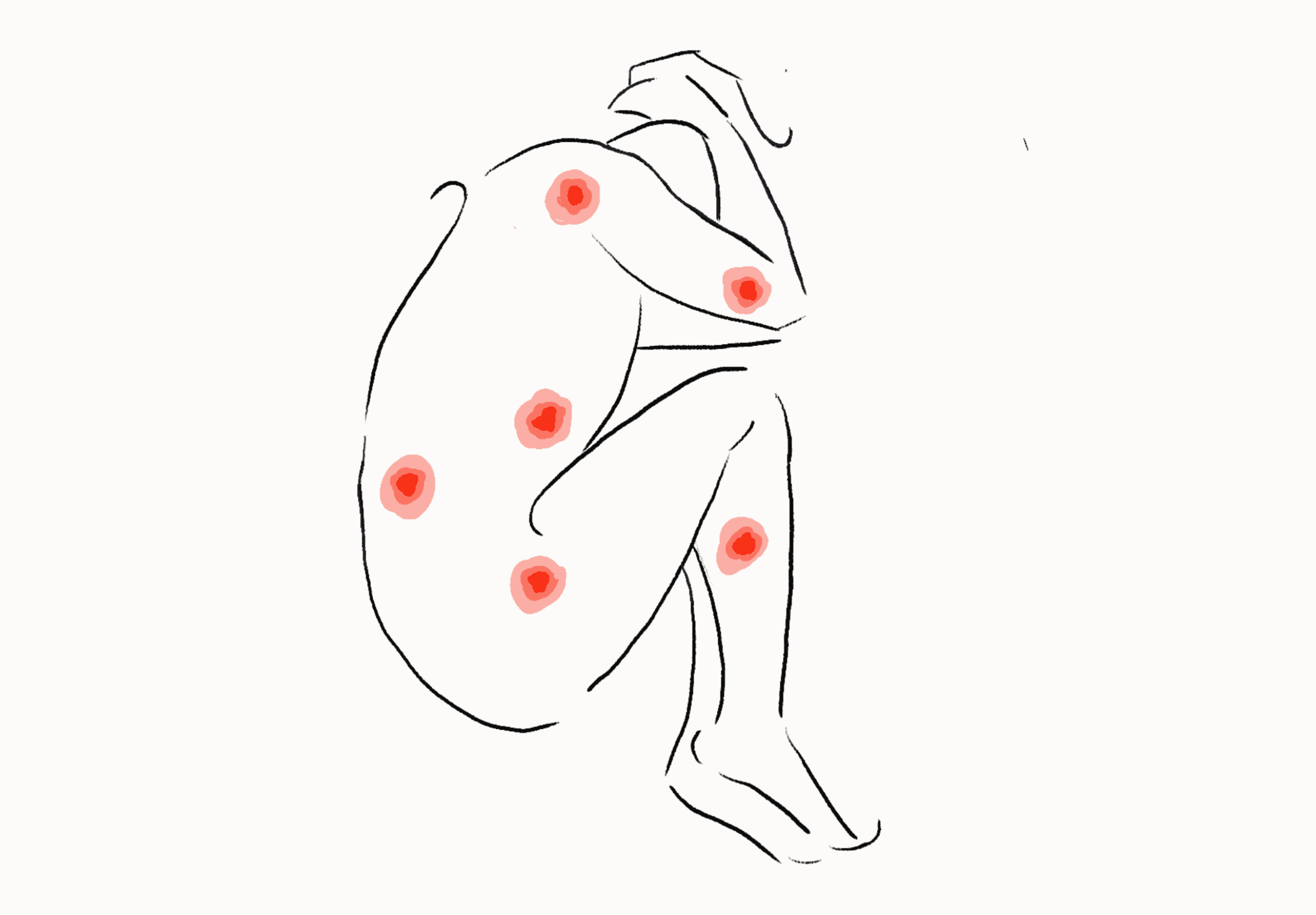
People With Chronic Pain Feel Misunderstood…
A study published under the National Institute of Health found that those enduring chronic pain report experiencing psychological distress when their family and friends invalidate their chronic pain experience because their pain is invisible.
So how can we bridge the gap in understanding between those living with chronic pain and those who haven't experienced it?
The Solution
Visio: Expanding Empathy and Understanding
Visio empowers those with chronic pain to manage symptoms and better communicate their struggles, fostering empathy and understanding. With self check-ins, physical therapy lessons, and CBT resources, it complements traditional treatments.
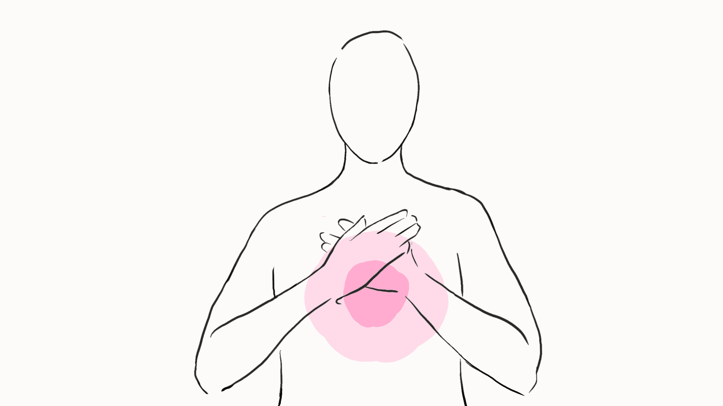
Visio: expanding knowledge and emotional vocabulary.
The Challenge
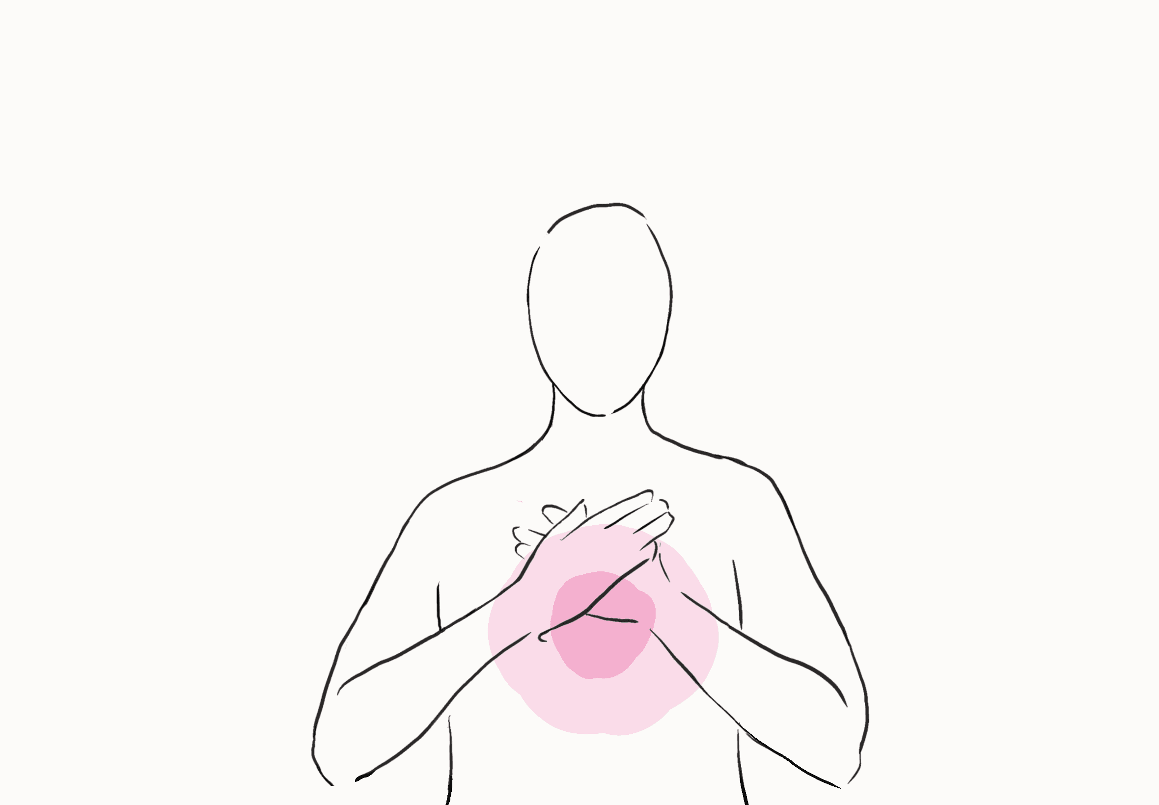
Designing a Daily Self Check-in Experience
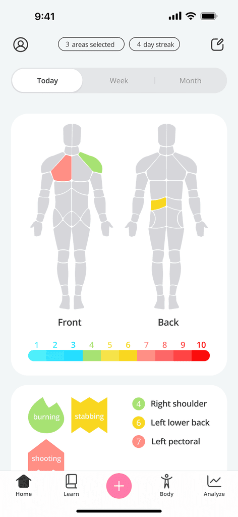
I was primarily tasked with designing Visio's daily check-in feature. Users are prompted to do a check-in to gather a broader dataset and monitor changes in mood and health over time. They may be asked to rate their pain, where it hurts, and how it makes them feel. Users may also provide information about medication they are taking and treatments.
The Goal of My Design:
Provide users with a self-sufficient solution to understand and manage their pain
Equip users with a tool to better communicate their experiences to caretakers and loved ones
Body Mapping
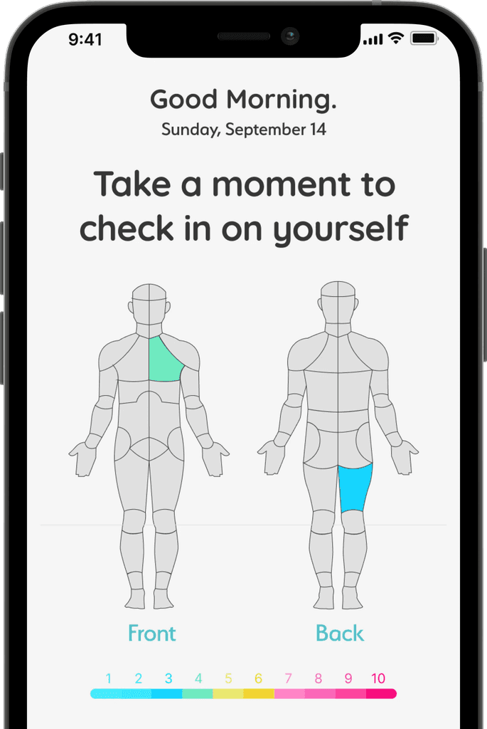
Body mapping allows for remote assessment of users over time. Frequent assessments may reveal tendencies and fluctuations more clearly and provide unique insights about the user’s condition.
Descriptive Pain Scale
Chronic pain is difficult to capture with traditional pain scales. Visio utilizes a more detailed and descriptive scale to obtain a more accurate assessment of how users feel.
More Personalization
Pain affects not only how users feel, but also what they do. Visio's check-in experience includes assessments of daily activity and medication to provide a comprehensive view of pain and treatments.
User Research
Identifying the problem
Method: survey
I conducted a survey of over 50 participants to identify key pain points. The goal was to understand how users felt about their chronic condition and how they communicate those feelings to caretakers and/or loved ones. I also asked about what treatments they used, and how effective they found it to be. Here are a few questions I focused on:
Questions
How effectively are you able to communicate your pain to others?
Do you utilize pain scales? If so, how useful do you find them to be?
What methods, if any, do you use to track changes in your pain?
Have you ever attempted any treatments to aid in relieving pain?
A frustrating aspect of living with chronic pain for users was not only the pain itself, but also the inability to elicit empathy from loved ones.
I feel alone in this. I don’t feel like i'm understood, and it’s isolating knowing that I can never be on the same level as my friends…
Chronic pain is also distracting, some days it is to difficult focus on anything but the pain. Survey results suggested that users were interested in having an easier way of keeping track of possible flair ups and irregularities in their pain from daily life to avoid all the mental heavy lifting.
As someone with autism and chronic pain it isn’t always easy for me to tell whether or not my symptoms are made worse by my daily activities/routine it would be nice to know what I could do to feel better.
Pain is extremely subjective. When rating pain, one person's 4 could be another person's 10 and it can be difficult to communicate the severity of the pain even to trained professionals. Numbers alone do not paint the full picture.
I can’t deal with any of these scales. Trying to give an objective number to a subjective experience when I can’t even be sure I’ve experienced the 1 or 10 for comparison is impossible. I can’t get my head around it.
So, from this information I concluded…
There needs to be a clearer way for those living with chronic pain to communicate and express how they feel to the uninitiated
Some Research Takeaways
1-10 pain scales must be descriptive in order to provide users with a more accurate understanding of how they feel.
Describing pain by its impact on physical activity can sometimes be more effective than a 1-10 scale.
The check-in experience should gather insights quickly and effectively.
So, from this information I concluded…
There needs to be a clearer way for those living with chronic pain to communicate and express how they feel to the uninitiated
Initial Design
Focusing On Navigation
For the initial design, I focused on capturing the core check-in experience, assessing how quickly users could navigate through it and how useful they found it to be.
Following each test session, we asked a pool of 25 users how often (everyday, frequently, infrequently, never) they would be willing to check-in and/or share insights about their pain gathered from the app with loved ones or caregivers.
Initial Results
45% of users said they would be willing to check-in infrequently.
52% of users said they would be willing to share insights from the check-in with loved ones or caregivers.
Some users expressed that the interface was clunky and confusing to navigate through.
Improving Frequency Of Use
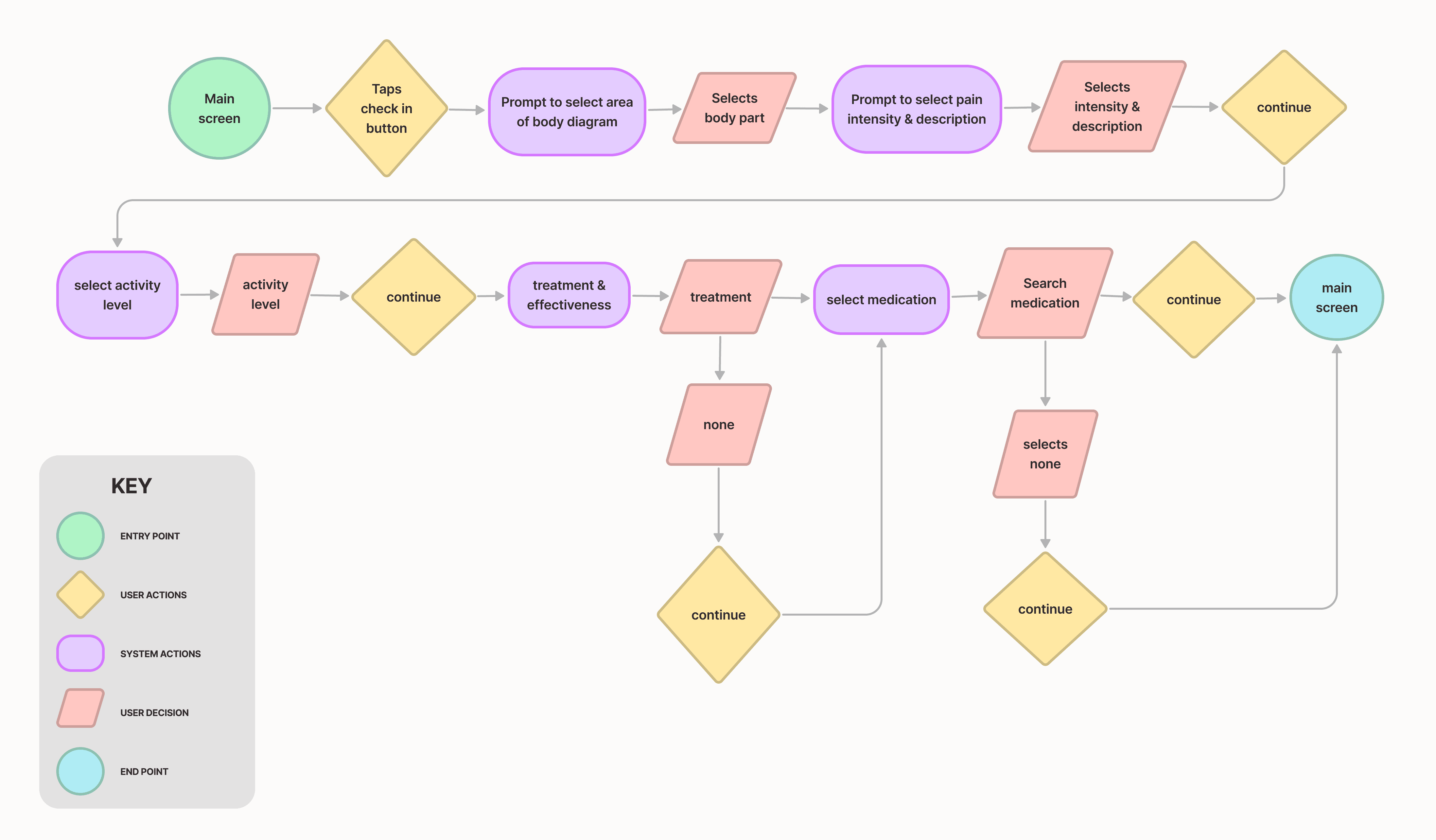
User testing exposed a major issues with my design; while users saw the value in the check-in process, many found it tedious to get through. I needed a way to make the check-in easier and faster to complete which I assumed would result in higher frequency of use. I decided to reassess and lay things out more clearly with a user-flow as i had initially rushed through the first iteration due to time constraints.
I would lay out the entire check-in process; from selecting areas of pain, rating pain and describing it, as well as activity level and any medication/treatment.
Final Design
An Organized & Efficient Experience
For the final iteration I used a bottom sheet in order to better organize information and help users check-in faster. The interface was also simplified with a minimal color scheme for clearer navigation.
I would conduct another similar user testing session for the final design with the same group of users, yielding surprising insights!
An Organized And Efficient Experience
For the final iteration I used a bottom sheet in order to better organize information and improve task completion. The interface is also simplified with a minimal color scheme for clearer navigation.
I also conducted another user testing session for the final design with a slightly smaller group of 21 users, yielding surprising insights!
Final Design
Final Results
48% of users said they would be willing to check-in often
60% of users said they would be willing to share insights from the check-in with loved ones or caregivers
Users expressed better overall understanding of the check-in process
Focusing On Navigation
For the initial design, I focused on capturing the core check-in experience, assessing how quickly users could navigate through it and how useful they found it to be.
Following each test session, we asked a pool of 25 users how often (everyday, frequently, infrequently, never) they would be willing to check-in and/or share insights about their pain gathered from the app with loved ones or caregivers.
Initial Design
Initial Results
45% of users said they would be willing to check-in infrequently.
52% of users said they would be willing to share insights from the check-in with loved ones or caregivers.
Some users expressed that the interface was clunky and confusing to navigate through.
Conclusion
Measuring Success
6% increased frequency of use
An increased number of users expressed desire in utilizing the check-in experience frequently after design iterations
15% increased user satisfaction
User's reported higher rates of overall satisfaction following design iterations
Improved task completion time
Faster navigation of the check-in process, making it easier for users to keep track of flare ups and irregularities
What I've Learned
It's ok to have a messy process
The timeline of this project, along with many other difficulties, made it much more difficult to follow a typical design process and learning to embrace that taught me to be more adaptable.
There is no one-size-fits-all solution
Unlike more tangible previous projects, chronic pain is complex and elusive without firsthand experience. Every design decision required utmost empathy and caution. Many enduring chronic pain see it as simply a pain issue, not a management one, and our products goal did not resonate with them. Embracing this perspective was eye-opening.
Things I would do differently…
Taking the time to design a userflow before defining into any low or mid fedility designs
Spend more time polishing survey questions
Focus more on accessibility
What I've Learned
It's ok to have a messy process
The timeline of this project, along with many other difficulties, made it much more difficult to follow a typical design process and learning to embrace that taught me to be more adaptable.
There is no one-size-fits-all solution
Unlike more tangible previous projects, chronic pain is complex and elusive without firsthand experience. Every design decision required utmost empathy and caution. Many enduring chronic pain see it as simply a pain issue, not a management one, and our products goal did not resonate with them. Embracing this perspective was eye-opening.
Unlike more tangible previous projects, chronic pain is complex and elusive without firsthand experience. Every design decision required utmost empathy and caution. Many enduring chronic pain see it as simply a pain issue, not a management one, and our products goal did not resonate with them. Embracing this perspective was eye-opening.
Things I would do differently…
Taking the time to design a userflow before defining into any low or mid fedility designs
Spend more time polishing survey questions
Focus more on accessibility
Improving Frequency Of Use
User testing exposed a major issues with my design; while users saw the value in the check-in process, many found it tedious to get through. I needed a way to make the check-in easier and faster to complete which I assumed would result in higher frequency of use. I decided to reassess and lay things out more clearly with a user-flow as i had initially rushed through the first iteration due to time constraints.
I would lay out the entire check-in process; from selecting areas of pain, rating pain and describing it, as well as activity level and any medication/treatment.

Congrats! You've reached the end. Wanna see more?
Let's work
together!
Let's work
together!
Let's work
together!
The Problem
People with chronic pain feel misunderstood…
A study published under the National Institute of Health found that those enduring chronic pain report experiencing psychological distress when their family and friends invalidate their chronic pain experience because their pain is invisible.


User Research
Method: survey
Identifying The Problem
I conducted a survey of over 50 participants to identify key pain points. The goal was to understand how users felt about their chronic condition and how they communicate those feelings to caretakers and/or loved ones. I also asked about what treatments they used, and how effective they found it to be. Here are a few questions I focused on:
I feel alone in this. I don’t feel like i'm understood, and it’s isolating knowing that I can never be on the same level as my friends…
As someone with autism and chronic pain it isn’t always easy for me to tell whether or not my symptoms are made worse by my daily activities/routine it would be nice to know what I could do to feel better.
I can’t deal with any of these scales. Trying to give an objective number to a subjective experience when I can’t even be sure I’ve experienced the 1 or 10 for comparison is impossible. I can’t get my head around it.
How effectively are you able to communicate your pain to others?
What methods, if any, do you use to track changes in your pain or well-being?
Have you ever attempted any treatments to aid in relieving pain?
Questions
A frustrating aspect of living with chronic pain for users was not only the pain itself, but also the inability to elicit empathy from loved ones.
Chronic pain is also distracting, some days it is to difficult focus on anything but the pain. Survey results suggested that users were interested in having an easier way of keeping track of possible flair ups and irregularities in their pain from daily life to avoid all the mental heavy lifting.
Pain is extremely subjective. When rating pain, one person's 4 could be another person's 10 and it can be difficult to communicate the severity of the pain even to trained professionals. Numbers alone do not paint the full picture.
So, from this information I concluded…
There needs to be a clearer way for those living with chronic pain to communicate and express how they feel to the uninitiated
1-10 pain scales must be descriptive in order to provide users with a more accurate understanding of how they feel
Describing pain by its impact on physical activity can sometimes be more effective than a 1-10 scale
The check-in experience should gather insights quickly and effectively
Some Research Takeaways
User testing exposed a major issues with my design; while users saw the value in the check-in process, many found it tedious to get through. I needed a way to make the check-in easier and faster to complete which I assumed would result in higher frequency of use. I decided to reassess and lay things out more clearly with a user-flow as i had initially rushed through the first iteration due to time constraints.
I would lay out the entire check-in process; from selecting areas of pain, rating pain and describing it, as well as activity level and any medication/treatment.
Improving Frequency Of Use


Body Mapping
Body mapping allows for remote assessment of users over time. Frequent assessments may reveal tendencies and fluctuations more clearly and provide unique insights about the user’s condition.
Descriptive Pain Scale
Chronic pain is difficult to capture with traditional pain scales. Visio utilizes a more detailed and descriptive scale to obtain a more accurate assessment of how users feel.
More Personalization
Pain affects not only how users feel, but also what they do. Visio's check-in experience includes assessments of daily activity and medication to provide a comprehensive view of pain and treatments.
Focusing On Navigation
Initial Design
For the initial design, I focused on capturing the core check-in experience, assessing how quickly users could navigate through it and how useful they found it to be.
Following each test session, we asked a pool of 25 users how often (everyday, frequently, infrequently, never) they would be willing to check-in and/or share insights about their pain gathered from the app with loved ones or caregivers.
45% of users said they would be willing to check-in infrequently
52% of users said they would be willing to share insights from the check-in with loved ones or caregivers
Some users expressed that the interface was clunky and confusing to navigate through
Initial Results
An Organized And Efficient Experience
Final Design
The final iteration uses a bottom sheet for more dynamic element integration and improves task completion. The interface is also simplified with a minimal color scheme and a reorganized layout.
I also conducted another user testing session for the final design with a slightly smaller group of 21 users, yielding surprising insights!
Final Results
48% of users said they would be willing to check-in often
60% of users said they would be willing to share insights from the check-in with loved ones or caregivers
Users expressed better overall understanding of the check-in process
Conclusion
Measuring Success
6% increased frequency of use
An increased number of users expressed desire in utilizing the check-in experience frequently after design iterations
15% increased user satisfaction
User's reported higher rates of overall satisfaction following design iterations
Improved task completion time
Faster navigation of the check-in process, making it easier for users to keep track of flare ups and irregularities
What I've Learned
It's ok to have a messy process
There is no one-size-fits-all solution
The timeline of this project, along with many other difficulties, made it much more difficult to follow a typical design process and learning to embrace that taught me to be more adaptable.
Unlike more tangible previous projects, chronic pain is complex and elusive without firsthand experience. Every design decision required utmost empathy and caution. Many enduring chronic pain see it as simply a pain issue, not a management one, and our products goal did not resonate with them. Embracing this perspective was eye-opening.
Things I would do differently…
Taking the time to design a userflow before defining into any low or mid fedility designs
Spend more time polishing survey questions
Focus more on accessibility
Body Mapping
Body mapping allows for remote assessment of users over time. Frequent assessments may reveal tendencies and fluctuations more clearly and provide unique insights about the user’s condition.
The Solution
Visio: expanding knowledge and emotional vocabulary.
Visio is an app designed to supplement conventional methods of chronic pain management.
This case study will focus on my design process of the daily check-in flow. Which focuses on gathering a broad dataset based on user input and monitors changes in health over time.

Visio: expanding knowledge and emotional vocabulary.
The Solution
Visio is a pain management app designed to complement traditional treatments for chronic pain, offering self check-ins, physical therapy lessons, and CBT resources. With so much to offer, this case this case study will focus specifically on the design of the daily check-in flow.

People With Chronic Pain Feel Misunderstood…
The Problem
A study published under the National Institute of Health found that those enduring chronic pain report experiencing psychological distress when their family and friends invalidate their chronic pain experience because their pain is invisible.

Descriptive Pain Scale
Chronic pain is difficult to capture with traditional pain scales. Visio utilizes a more detailed and descriptive scale to obtain a more accurate assessment of how users feel.
More Personalization
Pain affects not only how users feel, but also what they do. Visio's check-in experience includes assessments of daily activity and medication to provide a comprehensive view of pain and treatments.
